Pandas Built in Data Visualization:
Welcome to python crash course tutorial, today we will see the last topic Pandas Built in Data Visualization in the data science section.
SOME INTRODUCTION:
Data Visualizations is the presentation of data in graphical format. It help people understand the significance of data by summarizing and presenting a huge amount of data in a simple and easy-to-understand format and help communicate information clearly and effectively.
In this tutorial, we will learn about pandas built-in capabilities for data visualizations. It is built-off of matplotlib, but it baked into pandas for easier usage.
Let’s take a looks
Example:
Basic Plotting: plot
This functionality on Series and DataFrame is just a simple wrapper around the matplotlib libraries plot() methods.
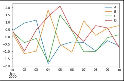
import pandas as pdimport numpy as npdf = pd.DataFrame(np.random.randn(10,4),index=pd.date_range('1/1/2000',periods=10), columns=list('ABCD'))df.plot()
Output:

If the index consists of dates, it calls gct().autofmt_xdate() to format the x-axis as shown in the above illustration.
We can plots one column versus another using the x and y keywords.
Plotting method allow a handful of plot styles other than the default line plot. These method can be provided as the kind keyword argument to plots(). These include −
- bar or barh for bar plots
- hist for histogram
- box for boxplot
- 'area' for area plots
- 'scatter' for scatter plots
(Note: For detailed information please click here)
BEST OF LUCK!!!


.png)


.png)


0 Comments:
Post a Comment