Monday, 10 September 2018

Statisticsl Functions - Correlation and Example in R Language

Descriptive Statistics :

First hand tools which gives first hand information.
  • Central tendency of data
  • Variation in data
  • Structure and shape of data tendency
  • Relationship study (correlation coefficient, rank correlation, correlation ratio, regression etc.)
Bivariate Data

Quantitative measures provide quantitative measure of relationship.

Graphical plots provide first hand visual information about the nature and degree of relationship between two variables.

Relationship can be linear or nonlinear.


x, y : Two data vectors

Data    x = (x1,x2,....,xn)                       y = (y1,y2,...,yn)

cov (x,y) :    covariance between x and y
var (x)Variance of x


Correlation coefficient

Measures the degree of linear relationship between the two variables.
cor (x,y) : correlation between x and y


Example :-

Covariance:

Example :-

Correlation coefficient:
Exact positive linear dependence

> cor ( c(1,2,3,4) , c(1,2.3,4)  )
 [1]  1


Data on Daily water Demand


Statistical Function bivariate three dimensional plot in R Language

Bivariate Plot :

Provide first hand visual information about the nature and degree of relationship between two variables.

Relationship can be linear or nonlinear.

We discuss several types of plots through example.


Scatter Plot :

plot command:
x, y : Two data vectors
plot (x,y)
plot (x, y, type)


Get more details from help: help ("type")
Other options:

main             an overall title for the plot.
suba              sub title for the plot.
xlaba             title for the x axis.
ylaba             title for the y axis.
aspthe           y/x aspect ratio.

Example :

Daily water demand in a city depends upon weather temperature.

We know from experience that water consumption increase as weather temperature increase. 

Date on 27 days is collected as follows:
Daily water demand (in million liters)
water <- c (33710, 31666, 33495, 32758, 34067, 36069, 37497, 33044, 35216, 35383, 37066, 38037, 38495, 39895, 41311, 42849, 43038, 43873, 43923, 45078, 46935, 47951, 46085, 48003, 45050, 42924, 46061)

Temperature (in centigrade)
temp <- c (23,25,25,26,27,28,30,26,29,32,33,34,35,38,39,42,43,44,45,45,.5,
45, 46,44,44,41,37,40)


Plot command:
 
x, y :  Two data vectors
Various type of plot are possible to draw.

plot (x, y)

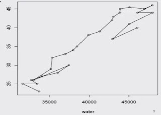
plot (water, temp)


plot (water, temp, "1")

"1" for lines,


plot (water, temp, "0")

"0" for both 'overplotted'


plot (water, temp, "h")

"h" for 'histogram' like 
(or 'high-density')
vertical lines 


plot (water, temp, "s")

"s" for stair steps.


Smooth Scatter plot

scatter.smooth (x, y) provides scatter plot with smooth curve 
Example: scatter.smooth (water, temp)


Matrix Scatter plot

The command pairs ( ) allows the simple creation of a matrix of scatter plots.
> pairs ( cbind (water, temp) )


3 Dimensional Scatter Plot:

Scatterplot3d ( ) Plots a three dimensional (3D) point cloud
> install.packages ("sccatterplot3d")
> library (scatterplot3d)
> setwd ("c: /RCourse/")
> data3d <- read.csv ("data-age-height-weight.csv")
> data3d
> scatterplot3d (data3d [, 1: 3])


More functions
  • contour ( )        for contour lines
  • dotchart ( )       for dot charts (replacement for bar charts)
  • image ( )           pictures with colors as third dimension
  • mosaicplot ( )   mosaic plot for (multidimensional) diagrams of of categorical variables (contingency tables)
  • persp ( )           perspective surfaces over the x-y plane


Sunday, 9 September 2018

Association Rule Mining in R Language

Association Rule Mining
  • In idea mining, Association Rule Learning is a popular and well researched method for discovering interesting relations between variables in large database.
  • It is intended to identify strong rules discovered in database using different measures of interests.
  • The rule found in the sales data of a supermarket would indicated that if a customer buys onions and potatoes together, he or she is likely to also buy hamburger meat.
  • Such information can be used as the basis for decisions about marketing activities such as, e.g., promotional pricing or product placements.

Constraints on below measures are used to select useful and best rules of all rules by R. After analyzing these values for all the rules, best rules for WB have been obtained.


E.g. :- Consider rule: {Jack the Ripper (1988)} => {Strawberry Blonde}
Let Jack the Ripper =X and Strawberry Blonde =Y, Then

Support (X U Y) = No of transactions involving both Jack the Ripper and Strawberry Blonde/Total no of transactions.

Confidence= No of transactions where Strawberry Blonde was also bought when Jack the Ripper was bought/ No of transactions where Jack the Ripper was bought

Lift = Ratio of observed support to the expected support


Friday, 7 September 2018

Statistical Function-Boxplots, Skewness and Kurtosis in R Language

Summary of observation

In R, quartiles, minimum and maximum values can be easily obtained by the summary command

summary (x)    x: data vector
It gives information on
  • minimum
  • maximum
  • first quartile
  • second quartile (median) and
  • third quartile.

Boxplot

Boxplot is a graph which summarizes the distribution of a variable by using its median, quartiles, minimum and maximum values.


boxplot ( ) draws a box plot


Descriptive Statistics:

First hand tools which gives first hand information.
  • Structure and shape of data tendency (symmetricity, skewness, kurtosis etc.)
  • Relationship study (correlation coefficient, rank correlation, correlation ratio, regression etc.)

Skewness

Measures the shift of the hump of frequency curve.
Coefficient of skewness based on values x1,x2,....,xn.


Kurtosis

Measures the peakedness of the frequency curve.
Coefficient of kurtosis based on values x1,x2,...,xn.


Skewness and Kurtosis

First we need to install a package 'moments'
> install.packages ("moments")
> library (moments)
skewness  ( )  :  computes coefficient of skewness
kurtosis    ( )   :  computes coefficient of kurtosis


Wednesday, 5 September 2018

Basics Calculations: Matrix Operations in R Language

In R, a 4 𝗑 2-matrix X can be created with a following command:

> x <-  matrix (nrow=4,   ncol=2,  data=c(1,2,3,4,5,6,7,8)  )

> x
                [,1]       [,2]
[1,]             1          5
[2,]             2          6
[3,]             3          7
[4,]             4          8

Properties of a Matrix

We can get specific properties of a matrix:


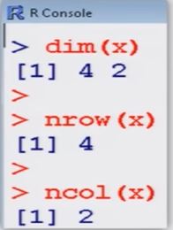
> dim (x)         # tells the
[1]   4   2             dimension of matrix

> nrow (x)       # tells
[1]  4                    the number of rows

> ncol (x)        # tells 
[1]  2                  the number of columns

> mode (x)      # Informs the type or storage mode of an object, e.g., numerical, logical etc.
[1]   "numeric"
attributes provides all the attributes of an object

> attributes (x)    # Informs the dimension of matrix 
$dim   [1]    4   2

Help on the Object "Matrix"

To know more about these important objects, we use R-help on "matrix".
> help ("matrix")
matrix     package:base            R Documentation
Matrices
Description :
'matrix'  creates a matrix from the given set of values.
'as.matrix' attempts to turn its argument into a matrix.
'is.matrix'  tests if its argument is a (strict) matrix. It is generic: you can write methods to handle specific classes of objects, see Internal Methods.

Then we get an overview on how a matrix can be created and what parameters are available:

Usage :
   matrix(data  [= NA, nrow = 1 , ncol = 1, byrow = FALSE, dimension = NULL)
  as.matrix (x)
  is. matrix (x)

Arguments :
  data: an optional data vector.
  nrow: the desired number of rows
  ncol: the desired number of columns
  byrow: logical. If 'FALSE' (the default) the matrix is filled by columns, otherwise the matrix is filled by rows.

dimnames:  A 'dimnames'  attribute for the matrix: a 'list' of length 2.
        x: an R object.

Finally, references and cross-references are displayed...
References :
  Becker, R. A.,  Chambers, J. M. and wilks, A.
  R. (1988)  _The New S Language_. wadsworth & Books/Cole.

See Also:
  'data.matrix' , which attempts to convert to a numeric matrix.
.... as well as an example:

Examples :
  is.matrix (as.matrix (1 : 10) )
  data (warpbreaks)
  ! is.matrix(warpbreaks) #  data.frame, NOT matrix!
  warpbreaks [1 : 10,]
  as.matrix(warpbreaks[1 : 10,])  #using
      as.matrix.data.frame(.) method


Matrix Operations 

Assigning a specified number to all matrix elements:

> x  <-  matrix (nrow=4, ncol=2, data=2 )
> x 
             [,1]    [,2]
[1,]         2        2
[2,]         2        2
[3,]         2        2
[4,]         2        2

Construction of a diagonal matrix, here the identity matrix of a dimension 2:

> d  <-  diag (1,  nrow=2,  ncol=2)
> d
        [,1]   [,2]
[1,]    1       0
[2,]    0       1


Transpose of a matrix x:  x'

>  x  <- matrix (nrow=4, ncol=2, data=1:8,  byrow=T )
>  x
                [,1]      [,2]
[1,]             1          2
[2,]             3          4
[3,]             5          6
[4,]             7          8

Multiplication of a matrix with a constant


Monday, 3 September 2018

Statistical Functions - Central Tendency and Variation in R language

Descriptive statistics :-

First hand tools which gives first hand information.
  • Central tendency of data (Mean, median, mode, geometric mean, harmonic mean etc.)
  • Variation in data (variance, standard deviation, standard error, mean deviation etc.)
Central tendency of the data

Gives an idea about the mean value of the data 
The data is clustered around what value?

Data:  𝒳1, 𝒳2, ......,𝒳n
x : Data vector
mean (x)

 prod (x) ^ (1/length (x) )
(length (x)  is equal to the number of elements in x)


Median :-

     Value such that the number of observation above it is equal to the number of observation below it.
median (x)

Example :-


Variability

spread and scatterdness of data around any point, preferably the mean value.

Data set 1:  360, 370, 380
    mean = (360 + 370 + 380) /3  = 370
Data set 2:  10, 100, 1000
    mean = (10 + 100 + 1000) /3  = 370

How to differentiate between the two data sets?

  x : data vector
      var (x)
positive square root of variance : standard deviation
        sqrt (var (x) )

Variance
Another variant,

If we want divisor to be n, then use
   ( (n-1) /n) * var (x)
where  n = length (x)

Range:
    maximum(x1, x2, ....., xn) - minimum(x1, x2, ...., xn)
      max (x)  -  min (x)

Interquartile range:
  Third quartile (x1, x2, ..., xn) - First quartile (x1, x2, ...., xn)
     IQR (x)

Quartile deviation:
  [Third quartile (x1, x2, ..., xn) - First quartile (x1, x2, ..., xn)]/2
   =  Interquartile range/2
    IQR (x) /2


Example :-


Sunday, 2 September 2018

Statistical Functions - Graphics and Plots in R Language

Graphics tools :

Graphics tools - various type of plots
  • 2D & 3D plots,
  • scatter diagram
  • Pie diagram
  • Histogram
  • Bar plot
  • Stem and leaf plot
  • Box plot ....
Appropriate number and choice of plots in analysis provides better inferences.

In R, such graphics can be easily created and saved in various formats.
  • Bar plot
  • Pie chart
  • Box plot
  • Grouped box plot
  • Scatter plot
  • Coplots
  • Histogram
  • Normal QQ plot ...

Bar plots :-

→ Visualize the relative or absolute frequencies of observed values of a variable.
→ It consists of one bar for each category.
→ The height of each bar is determined by either the absolute frequency or the relative frequency of the respective category and is shown on the y-axis.

barplot (x, width = 1, space = NULL ,...)
> barplot (table (x) )
> barplot (table (x) / length (x) )

Example :-
Code the 10 persons by using, say 1 for male (M) and 2 for female (F).
  M, F, M, F, M, M, M, F, M, M
   1,  2, 1,  2,  1,  1,   1,  2,  1,  1

> gender <-  c(1, 2, 1, 2, 1, 1, 1, 2, 1, 1) 
> gender
 [1]  1  2  1  2  1  1  1  2  1  1


Example :-
> barplot (gender)
Do you want this ?
2 categories 
M = 7
F  = 3


Pie diagram :-

Pie charts visualize the absolute and relative frequencies.

A pie chart is a circle partitioned into segments where each of the segments represents a category.

The size of each segment depends upon the relative frequency and is determined by the angle (frequency x 360 degree).

pie (x,  labels  = names (x),  ...)

Example :-

> pie (gender)


Histogram :-

Histogram is based on the idea to categorize the data into different groups and plot the bars for each category with height.

The area of the bar (= height x width ) is proportional to the relative frequency.

So the width of the bars need not necessarily to be the same

hist (x)  # show absolute frequencies 
hist (x, freq=F)   # show relative frequencies

see help ("hist") for more details


Popular Posts

Categories

100 Python Programs for Beginner (49) AI (34) Android (24) AngularJS (1) Assembly Language (2) aws (17) Azure (7) BI (10) book (4) Books (173) C (77) C# (12) C++ (82) Course (67) Coursera (226) Cybersecurity (24) data management (11) Data Science (128) Data Strucures (8) Deep Learning (20) Django (14) Downloads (3) edx (2) Engineering (14) Excel (13) Factorial (1) Finance (6) flask (3) flutter (1) FPL (17) Google (34) Hadoop (3) HTML&CSS (47) IBM (25) IoT (1) IS (25) Java (93) Leet Code (4) Machine Learning (59) Meta (22) MICHIGAN (5) microsoft (4) Nvidia (3) Pandas (4) PHP (20) Projects (29) Python (929) Python Coding Challenge (354) Python Quiz (22) Python Tips (2) Questions (2) R (70) React (6) Scripting (1) security (3) Selenium Webdriver (3) Software (17) SQL (42) UX Research (1) web application (8) Web development (2) web scraping (2)

Followers

Person climbing a staircase. Learn Data Science from Scratch: online program with 21 courses